Building visual worlds for brands, campaigns, and culture.
LOGO DEVELOPMENT & BRANDING
It began as a simple request: add a tagline to an already approved logo. But I saw more potential—an opportunity to rethink the brand from the ground up.
I proposed a full redesign, ultimately replacing the original with a stronger, more dynamic identity.
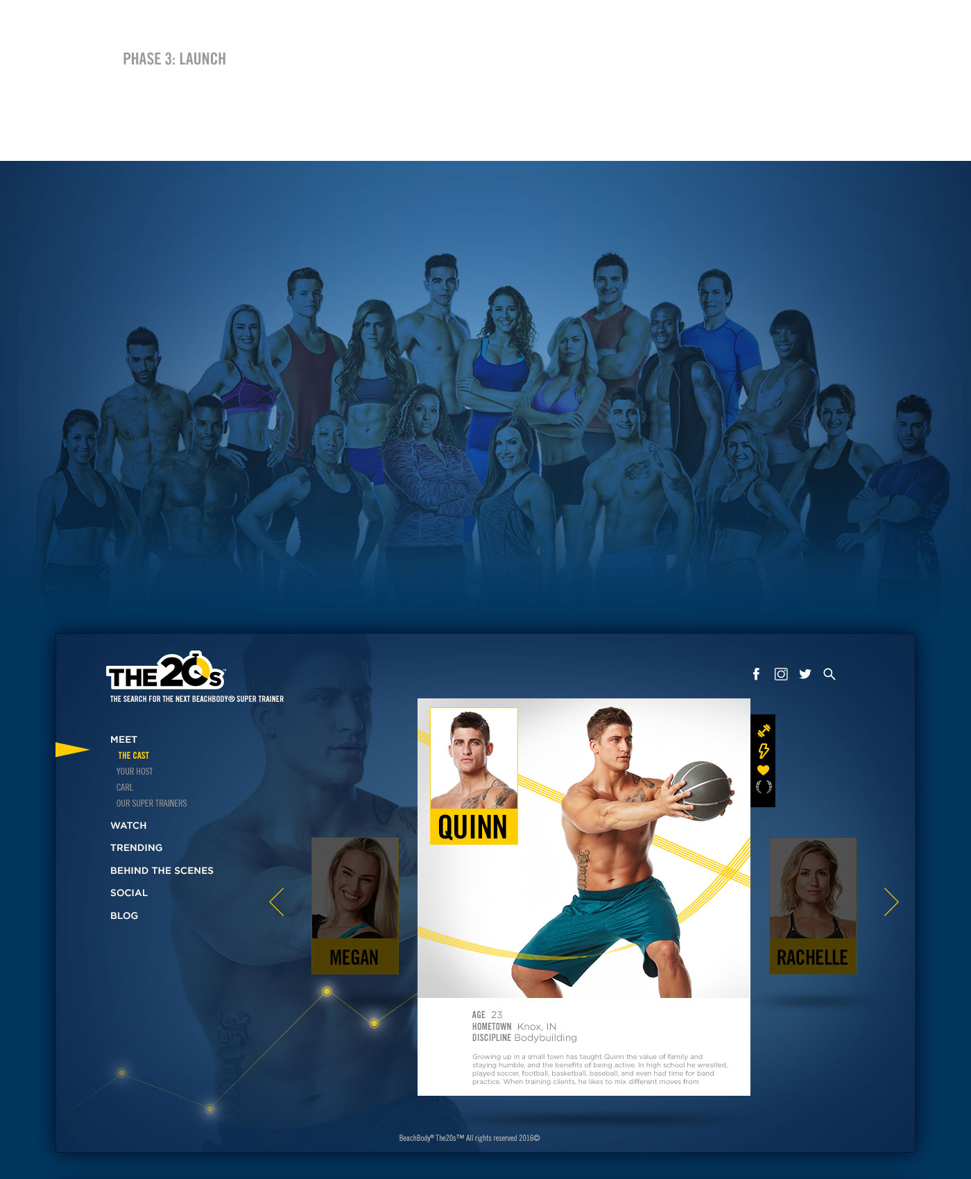
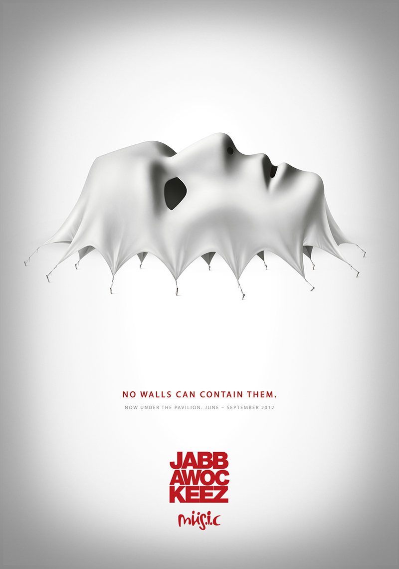
THE20s is Beachbody’s On Demand reality series, built around the search for the next great trainer to follow icons like Tony Horton, Autumn Calabrese, and Sagi Kalev.
Twenty competitors, one house, and a single goal: create a standout 20-minute workout and become the next Beachbody Super Trainer.
While working at Trailer Park, a company extremely well-known for its lengthy body of creative work in the entertainment industry, we were presented the opportunity to pursue one of the prime yet least talked-about brands in LA, the Los Angeles Clippers.
I had the privilege to Art Direct photoshoots, including the entire team roster, develop a large array of creative assets for Out-Of-Home, the Staples Center, Social Media, Presentation Decks, TV, the Fan van, and In-game programs.
Agency: Art Machine
CD: John McMahon
Photographer: Kyle Kristy
In early 2018, Spectrum Mobile entered the market.
The opportunity wasn’t just to show up—but to shift the visual language of the category through OOH.
We pushed beyond convention, crafting a bold, forward-looking direction designed to cut through and redefine expectations.
Role: Art Direction & Brand Design
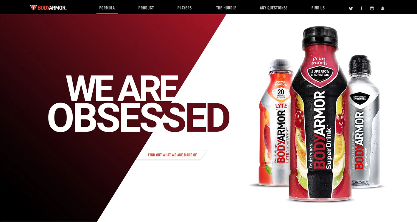
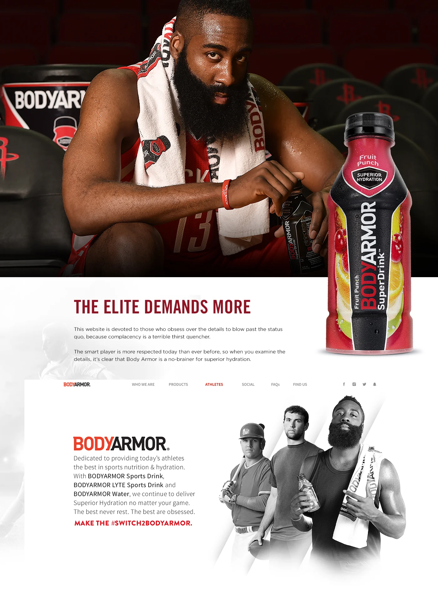
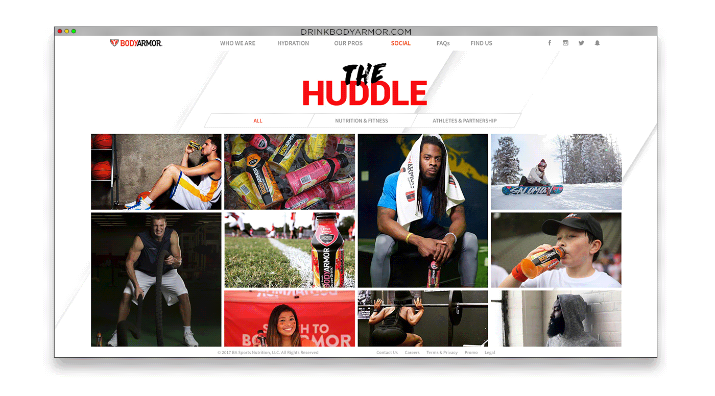
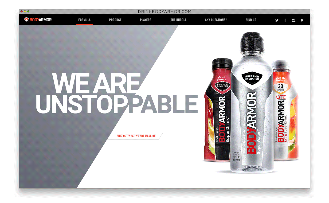
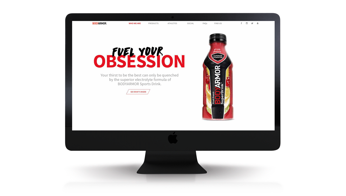
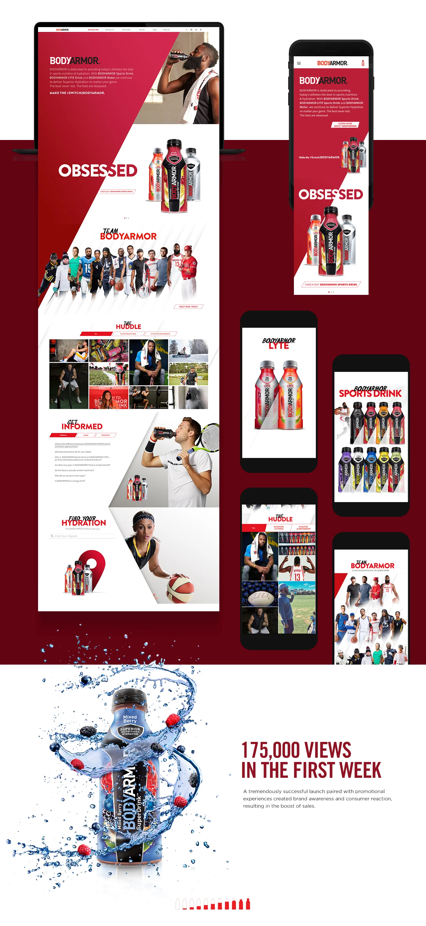
We were asked to design the new website for BodyArmor, a natural revolutionary sports drink.
Before the design process took place, we strategized the correct approach to encompass two groups who represented BodyArmor’s target audience, the “Moms” who were aware BodyArmor is a healthier option to their children, and the “Drinkers”, previously satisfied health-oriented consumers.
The UI and the UX presented a fresh execution of the goals: modern, compelling, informative, and aspirational.
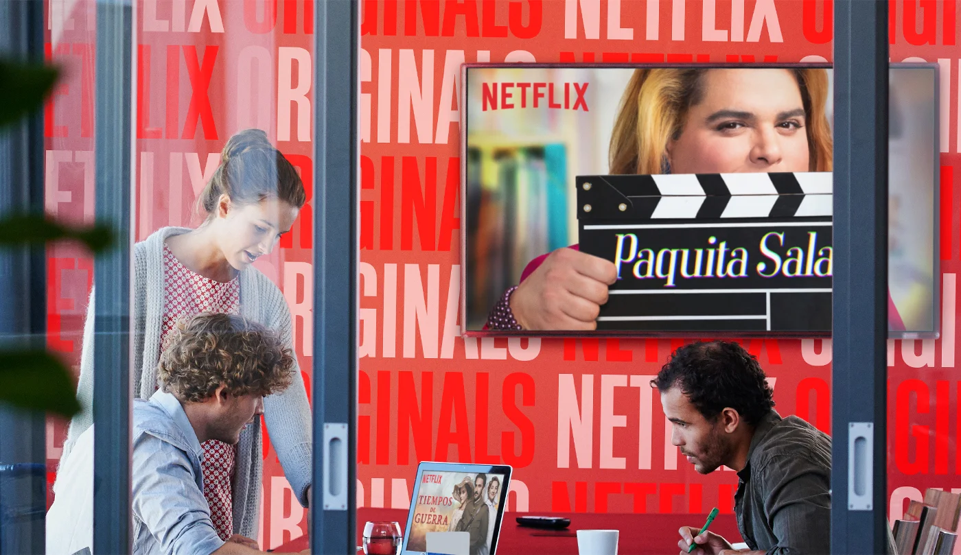
Art Direction
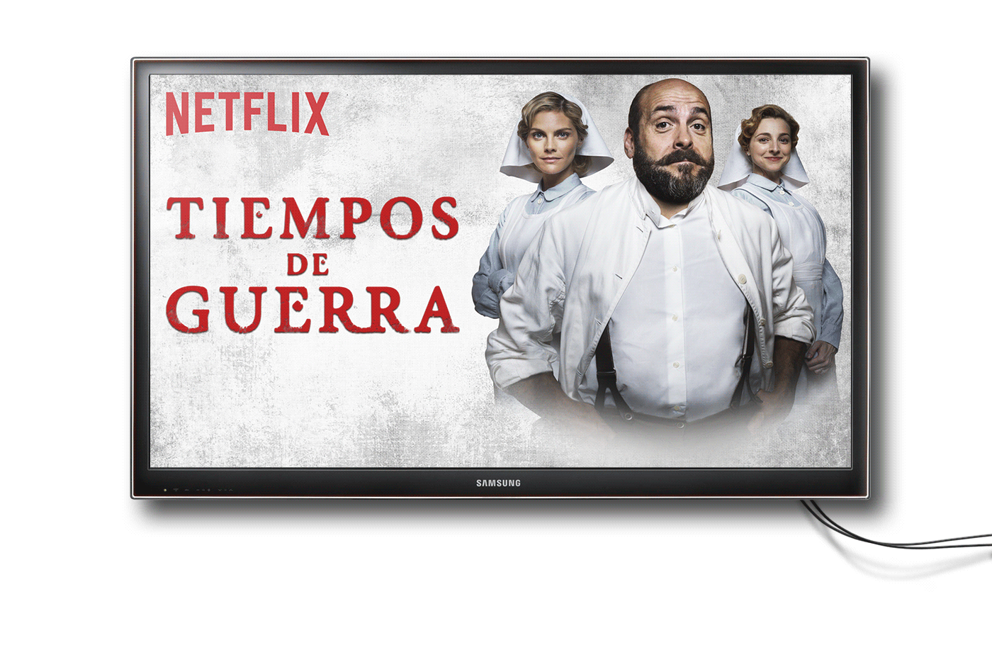
Show Titles and Display Art.
BRANDING
Client: Smoky Hollow Industries
Location: El Segundo, CA
SHI is the umbrella corporation of an Electric Engineering, Water Recycling, Commercial Real Estate, and Business Consulting companies.
We were hired to create brand identity and corporate guidelines to reflect its history, core values, and mission.
KEY ART | SET DESIGN
Clay and paper set design featured in Times Square, New York City.
I’ve always loved sculpting and when the opportunity came to create a set design that would be seen by thousands of people in the heart of the Big Apple, I jumped at it.
Client: Wrigley's Gummies
Agency: Vault49
Clay and paper set design featured in Times Square, New York City.
Branding design for Heir Society, a cannabis company based in Los Angeles, CA.
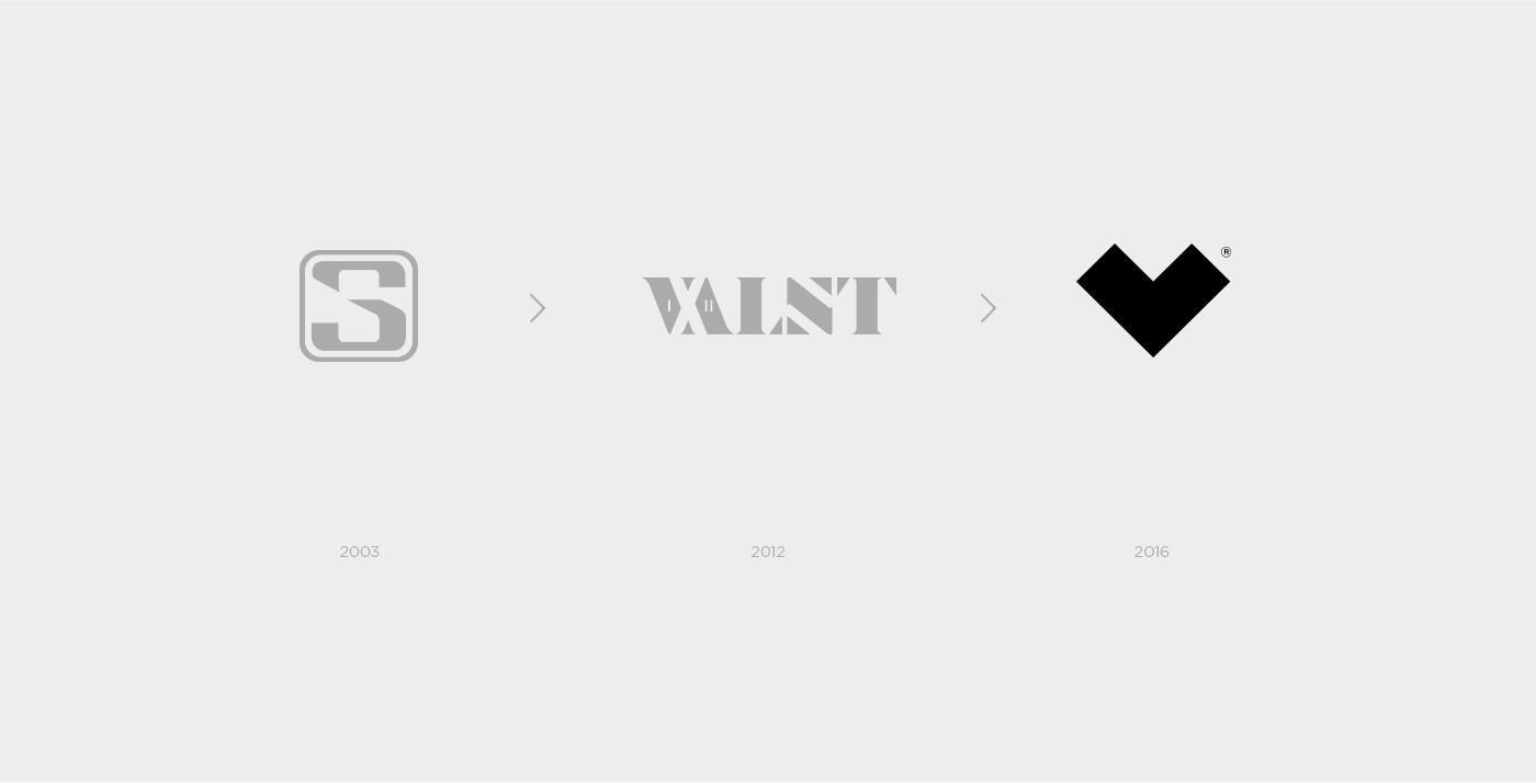
Branding for multi-disciplinary designer Rafael Valente whose work focus on brand identity, art direction, and illustration on digital and print media.
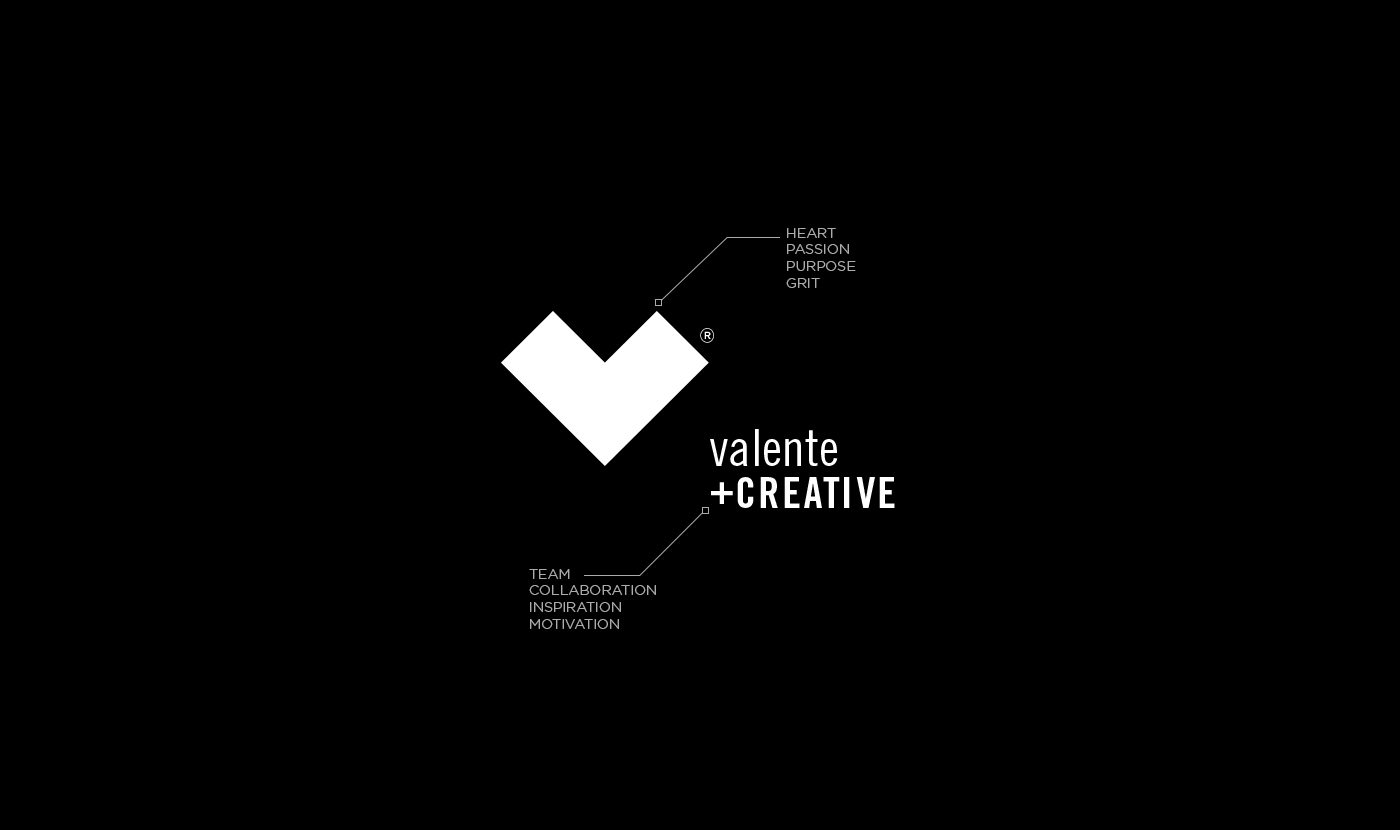
The logo has evolved over the years. This iconic, easy-to-recognize mark truly captures and represents Rafael, his mindset and work style moving forward. The heart shape was taken away from the V, his last name's initial is Valente, which means brave in Portuguese, his native language.
Having the confidence that your grit and hard-work will help you achieve your goals and create new opportunities to work with like-minded individuals, explains “plus" creative.
KEY ART | DIGITAL PAINTING
The Superbowl 50 season was a special one, and to launch the season I was hired to create this centerpiece for the NFL.com website.
This digital painting represents all the different phases of the football season. It was inspired by The Game Of Life but it also relates to the road to gold.
The season started in Chicago with the Draft, included some steps along the way in New England where the Kickoff took place, then moving to the International week in London, the ProBowl in Hawaii, and ending at the new San Francisco 49ers Levi's Stadium.
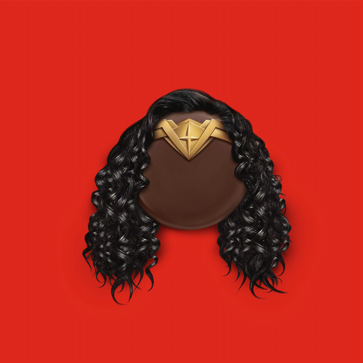
Illustrations, vector art, type treatments, image manipulation.